DARIA NIKULINA
Show Profile
Show Profile
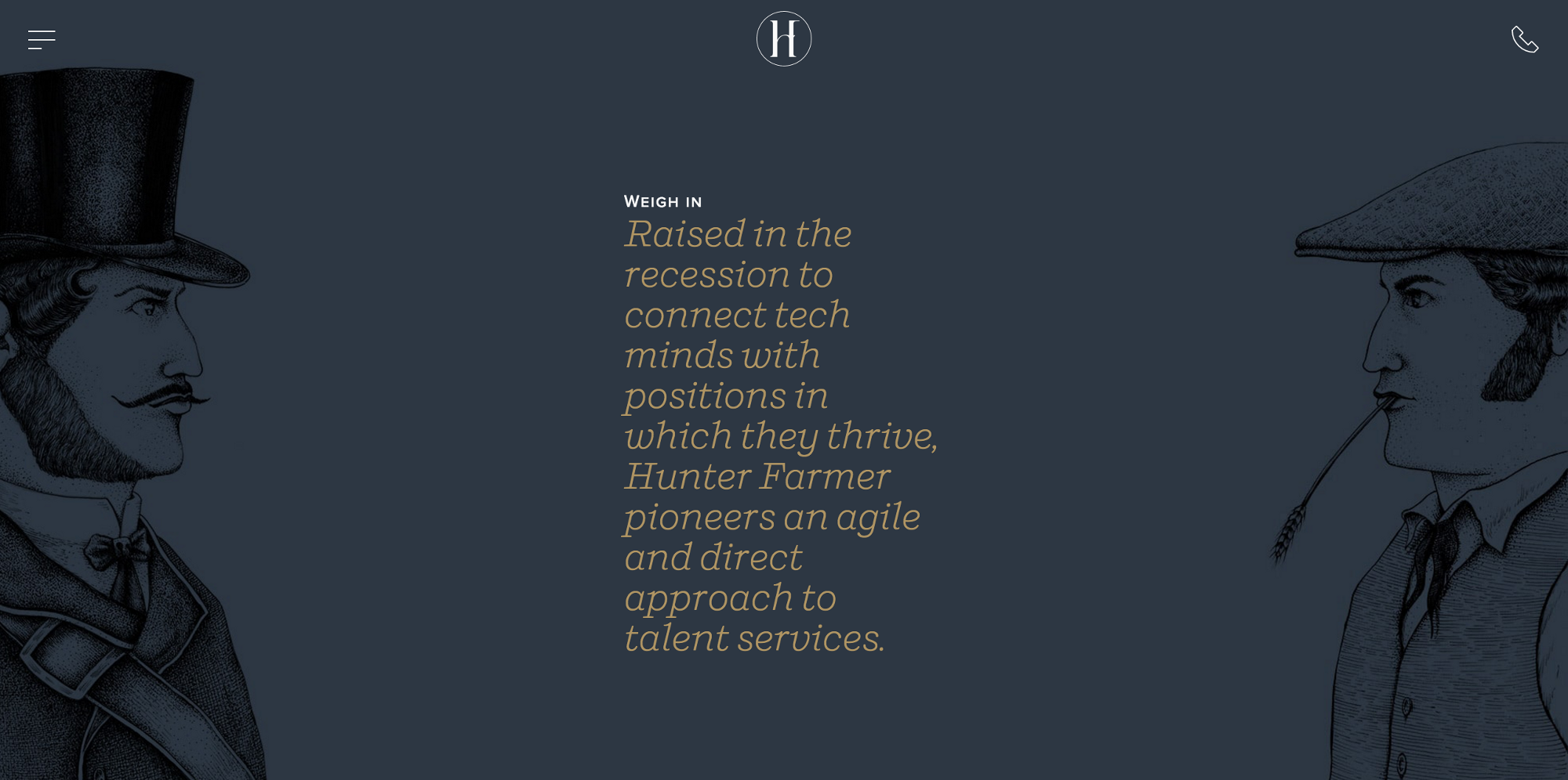
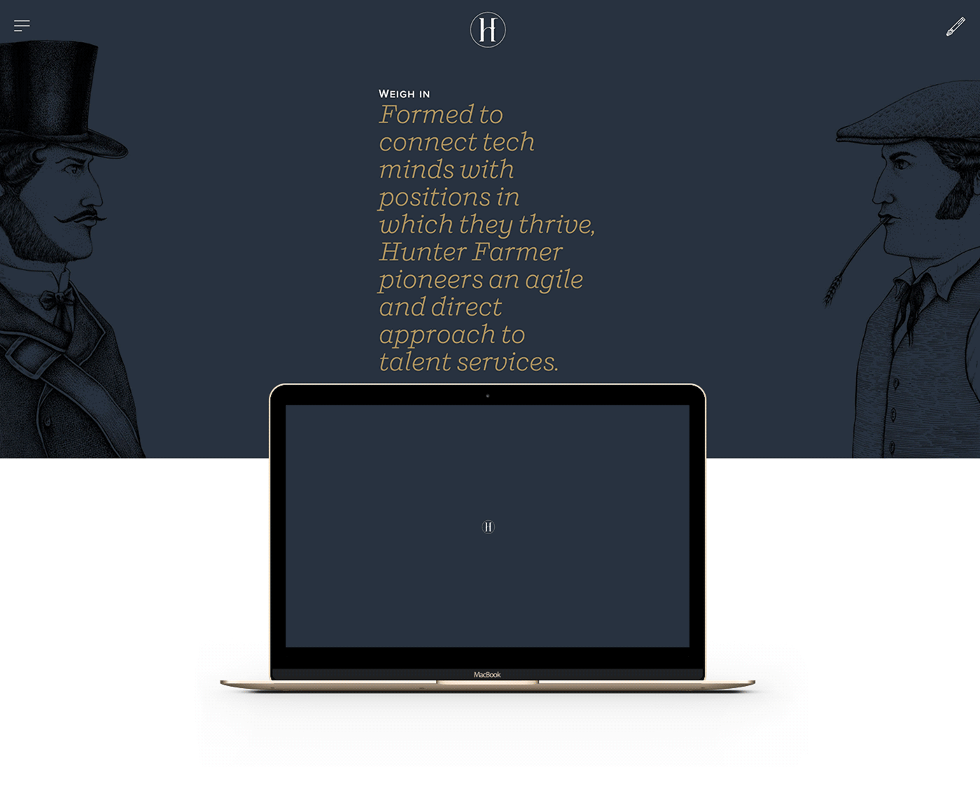
On my first day with Bonne Marque, I was given the important and challenging task of designing a logotype for Hunter Farmer: a recruitment agency based in London, whose plectrum-style multicoloured logo needed changing.

Their logo failed to give me an impression of the company, nor a clear vision of the brand attitude: what the brand wants to say to the client and what it stands for. It required dramatic changes and a strong personality that communicates with its audience in an outstanding way.
The challenging nature of the task rested in the fact that the majority of the design material for the project which included an a-z branding and web design was almost complete, meaning my design had to align perfectly.
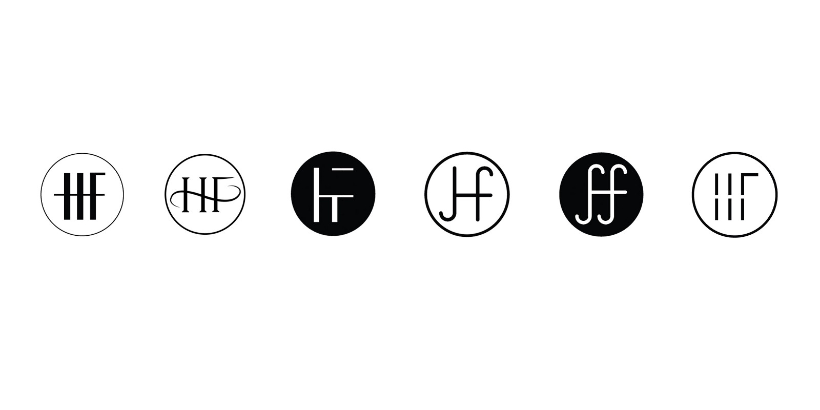
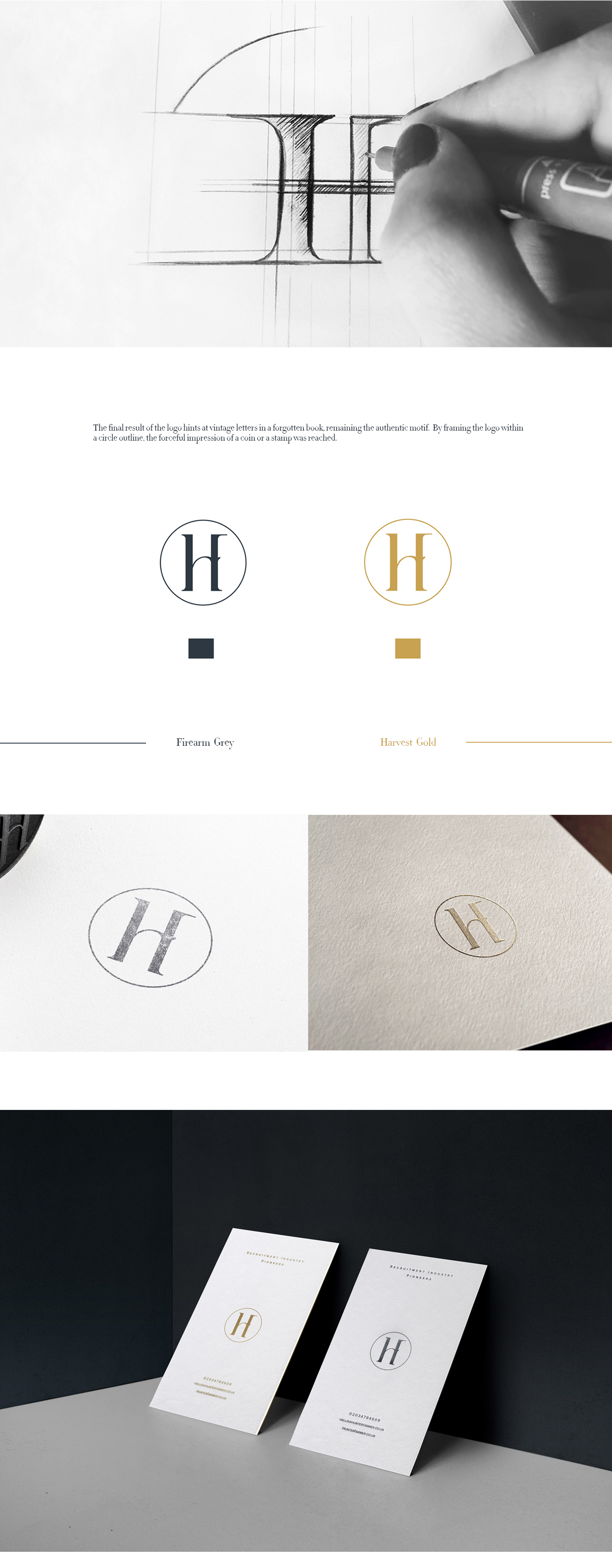
I preferred black and white variations of the logo opposed to color and even experimented with patterns. Eventually, I discovered this unique dark grey color very close to black which I took from the landing page of the new Hunter Farmer website.
Hunterfarmer